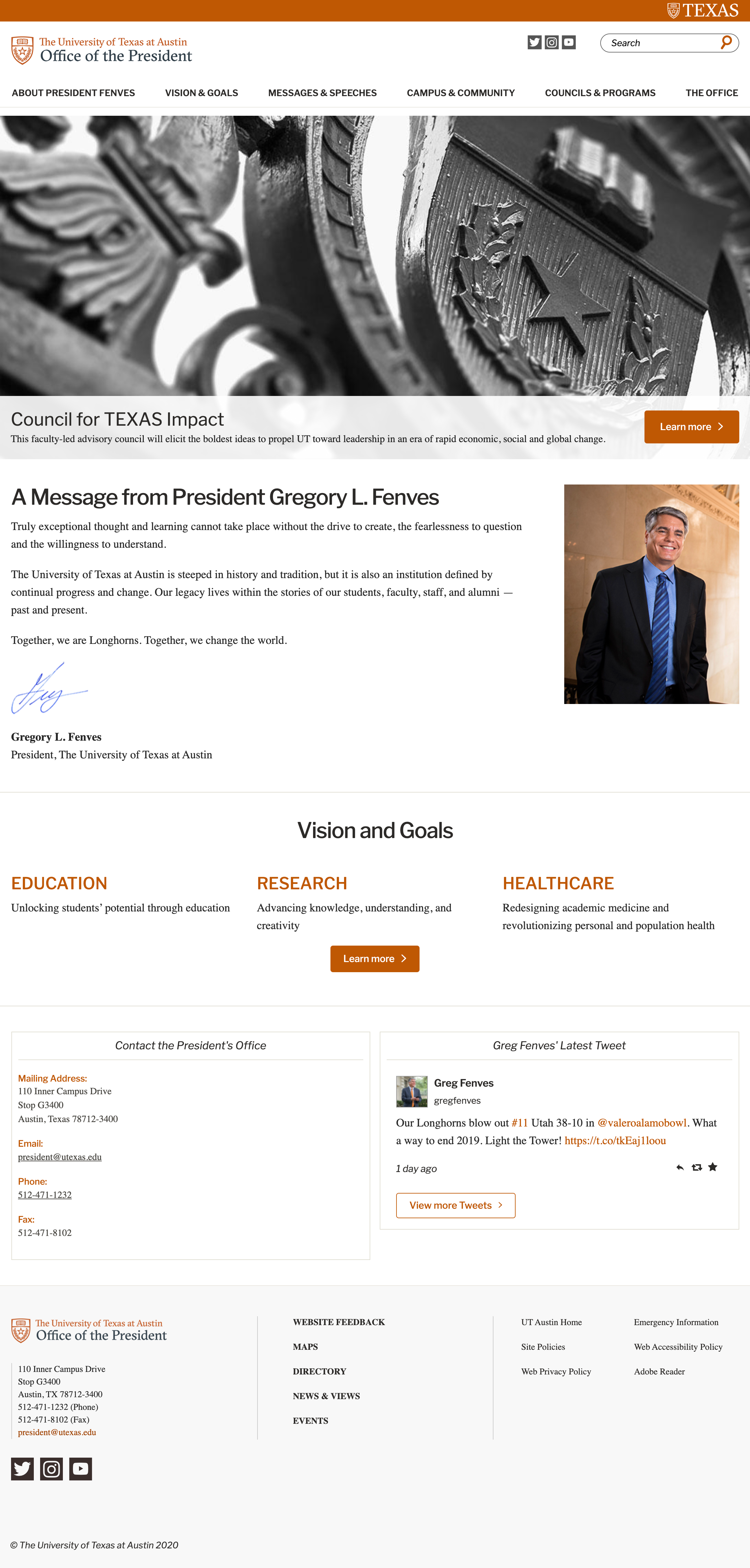
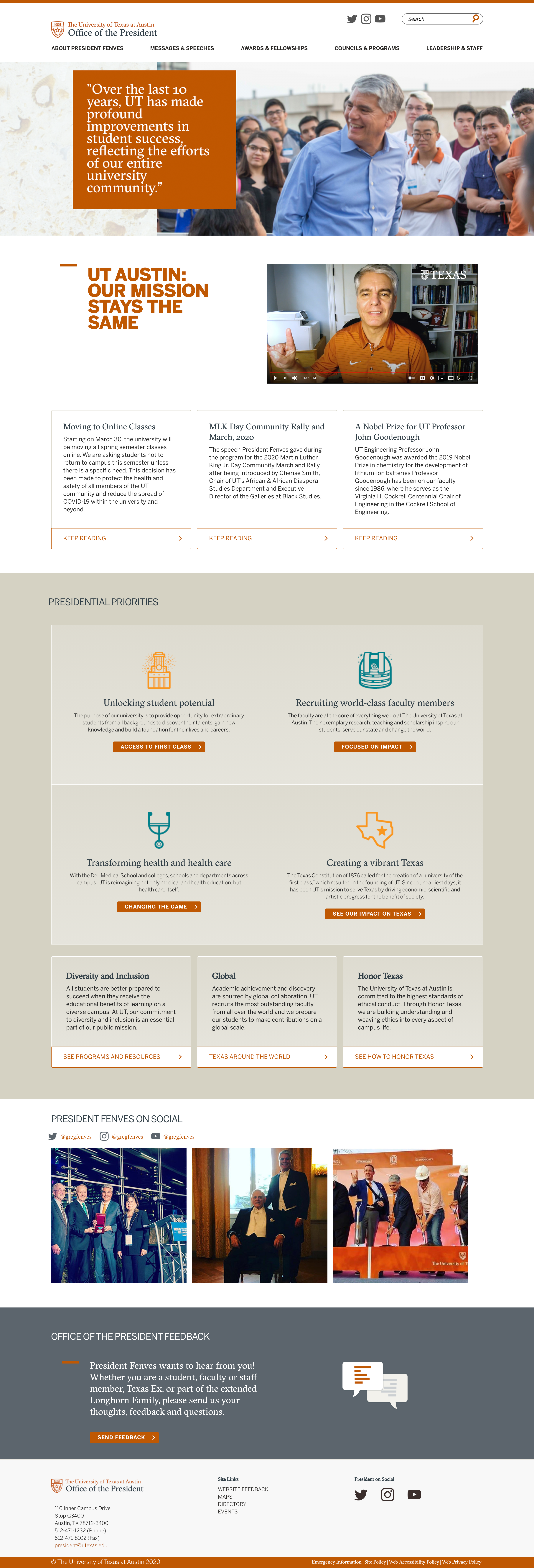
Goal: Update design, architecture, and technology for the outdated Office of the President Site
We knew that the website for the Office of the President was not a highly visited site, but considered a necessary site for the organization.
Brainstorming and Planning
Reviewing analytics we discovered there were a lot of pages that had very low visits. The secondary navigation often took users offsite and the content wasn’t organized well. Specifically, the main section “Campus & Community” seemed to be a catch all for information that didn’t fit in other sections of the site.

As we began to look at the current navigation and architecture we decided to get rid of the secondary navigation and create landing pages to give users a higher level view of the areas of importance for the Office of the President.
Navigation and Proposed Changes

In addition to removing the secondary navigation, we reorganized the content into buckets that made it clear to users what content you would find when going to each landing page, as well as other changes that included:
- Removing the “Vision & Goals” section entirely and moved it to the home page to highlight these presidential priorities.
- Adding four recent messages or speeches to the home page so users could get latest information from the Office of the President.
- Changing how the “Messages & Speeches” section worked. Instead of separating messages, speeches, and articles onto separate pages, put them all on one page with summaries and tagged each content type to indicate whether it was a message, speech, or article.
- Finding ways to showcase the President more with new imagery and instagram feed.
Wireframe
Homepages of Original Site and New Site at Launch


